Usher Tinkler
authentically different
A website for a Hunter Valley winemaker who pours wine in an old church. It had to feel as hand-made as the label on the bottle.
Visit ushertinklerwines.com ↗- Client
- Usher Tinkler Wines: a boutique winery in Pokolbin, in the Hunter Valley, with a cellar door and salumi bar in a renovated church
- My role
- Website design for desktop and mobile, and the CMS user guide. The brand identity is by Side B Creative
- Team
- Three designers, front-end and back-end developers, and a project lead
- When
- Early 2024 – end of 2024
- Tools
- Figma; Photoshop for images and enhancements
A brief with a view
the starting point
The client wanted the website refreshed, with room for more writing on it. They arrived with a moodboard and a page-by-page plan, and an ornate, vintage identity already drawn by another studio.
My part was the website: a new design, with nothing carried over from the old one.
Three jobs
one homepage
The site has to sell wine, fill the cellar door and grow the wine club, which the winery calls The Society. The shop and the member area run on a separate platform, so the design also has to make that hand-off feel like one place.
The homepage gives each job its own section, in the order a visitor is likely to need them.
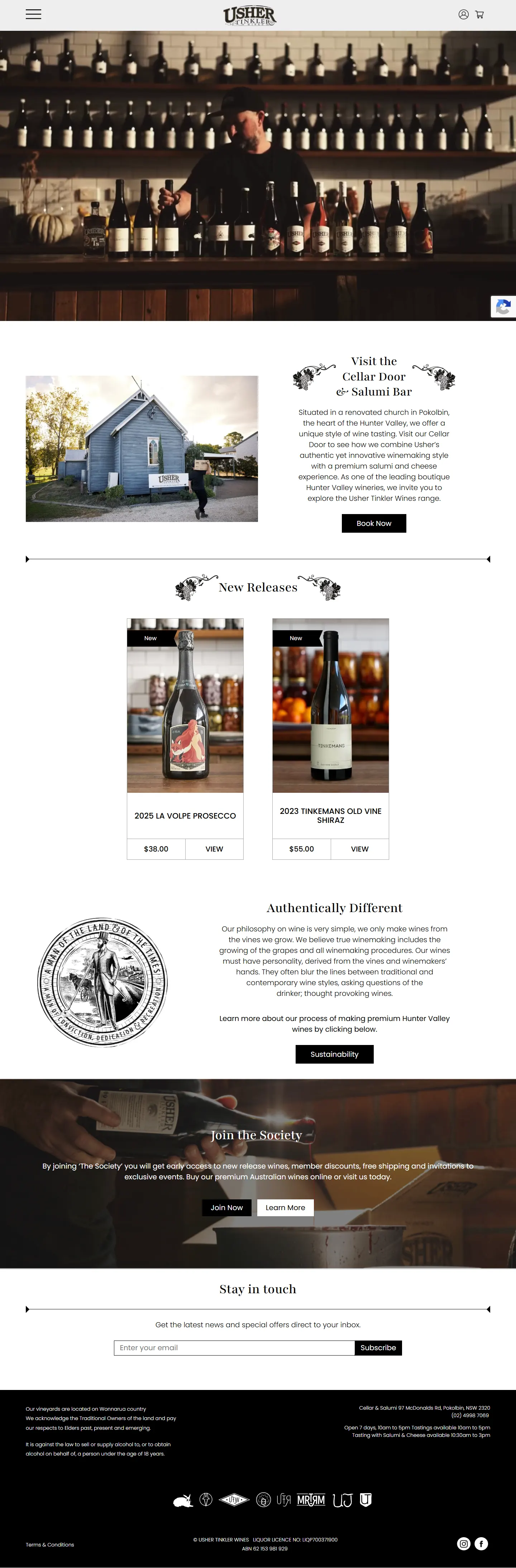
three jobs, one page
The homepage has to sell wine, fill the cellar door and grow the wine club. Pick a job to see where the page does it.
Black and white
and a lot of photographs
The pages are black and white with a centred logo and a slide-out menu, and they let the photography of food, bottles and the church do the talking. The engraved flourishes beside each heading come from the identity.
I designed Home, Our Story, Visit Us, The Society, Events, Work With Us, Contact and the blog templates for desktop and mobile.
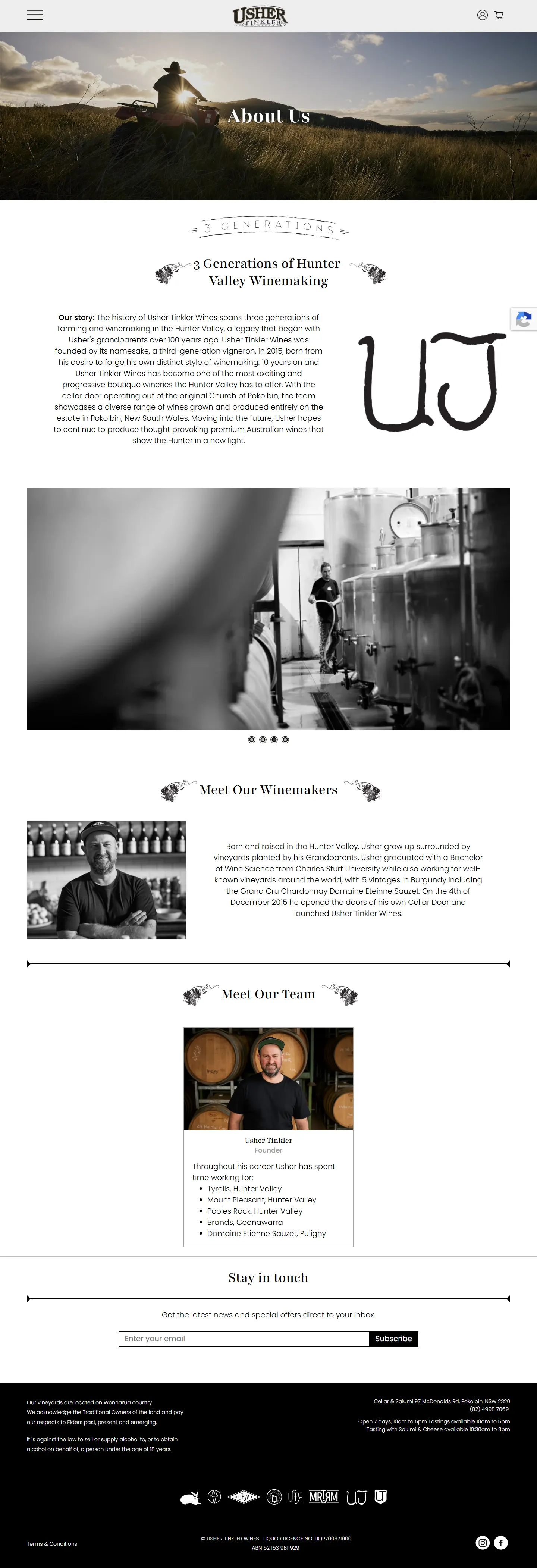
Scroll inside the frame
Handing it over
a guide for the client
The winery edits the site itself, so the project closed with a user guide I designed and wrote up: ten content areas, each a numbered walk-through with annotated screenshots.
Every image on the site was also resized and converted to WebP for desktop and mobile, so the photographs stay heavy on atmosphere and light on loading.
- 23
- pages in the CMS user guide
- 10
- content areas the client can edit
- 47
- images resized and converted to WebP
- 2
- layouts for every page: desktop and mobile

Scroll inside the frame