Holiday Valley
one resort, one voice
A design system and a content engine for a resort that was being impersonated online, so that the real Holiday Valley is the one people recognise.
Visit holidayvalleyresorts.com ↗- Client
- Holiday Valley Hotels & Resorts: a countryside resort near Hosur, about an hour from Bangalore
- My role
- Senior designer on the account. I built the design system, design the social and print work, and train a junior designer
- Team
- Digital marketing, content writer, one junior designer
- When
- End of 2024 – ongoing
- Tools
- Figma, Photoshop, Illustrator, Magnific for image and video, Claude with Figma and other MCP connectors
Too many voices
the starting point
Holiday Valley had fake social accounts using its name, and no consistent look of its own to tell the real ones apart. The brief was to give the brand a proper foundation and make its own accounts unmistakable.
That meant deciding what the resort looks and sounds like before making a single post.
- 18
- villa brochures from one nine-page template
- 9
- social campaigns, planned by audience
- 13
- colour pairings tested and written down
- 2
- typefaces: Playfair Display and Poppins
A system first
before a single post
I built the design system in Figma and wrote it up as a reference: named colour tokens, a serif with one italic word per headline to carry the feeling, scales for spacing and radius, and components on light and dark.
Every colour pairing is checked against accessibility thresholds and given a pass or a fail. The brand’s lime, for one, is only allowed on dark. Try it on paper below and you will see why.
— Stays & experiences
serenity
Enjoy a calming escape in nature-hugged cottages, an hour from the city.
5.96 : 1
color/accent on surface/dark. Flourish on dark. Lime is reserved for dark surfaces.
— Documented pairings · 11 of 13
Pick a text colour and a surface, or choose a documented pairing
Eighteen villas
one brochure
Every villa gets the same nine pages: cover, the villa in a paragraph with its key facts, a hero photograph, the spaces, amenities, a second photograph, the wider resort, a gallery and contact.
The template has been filled eighteen times, each with the villa’s own photography and copy from our content writer. The brochures are sent digitally and printed. Here are four of them.
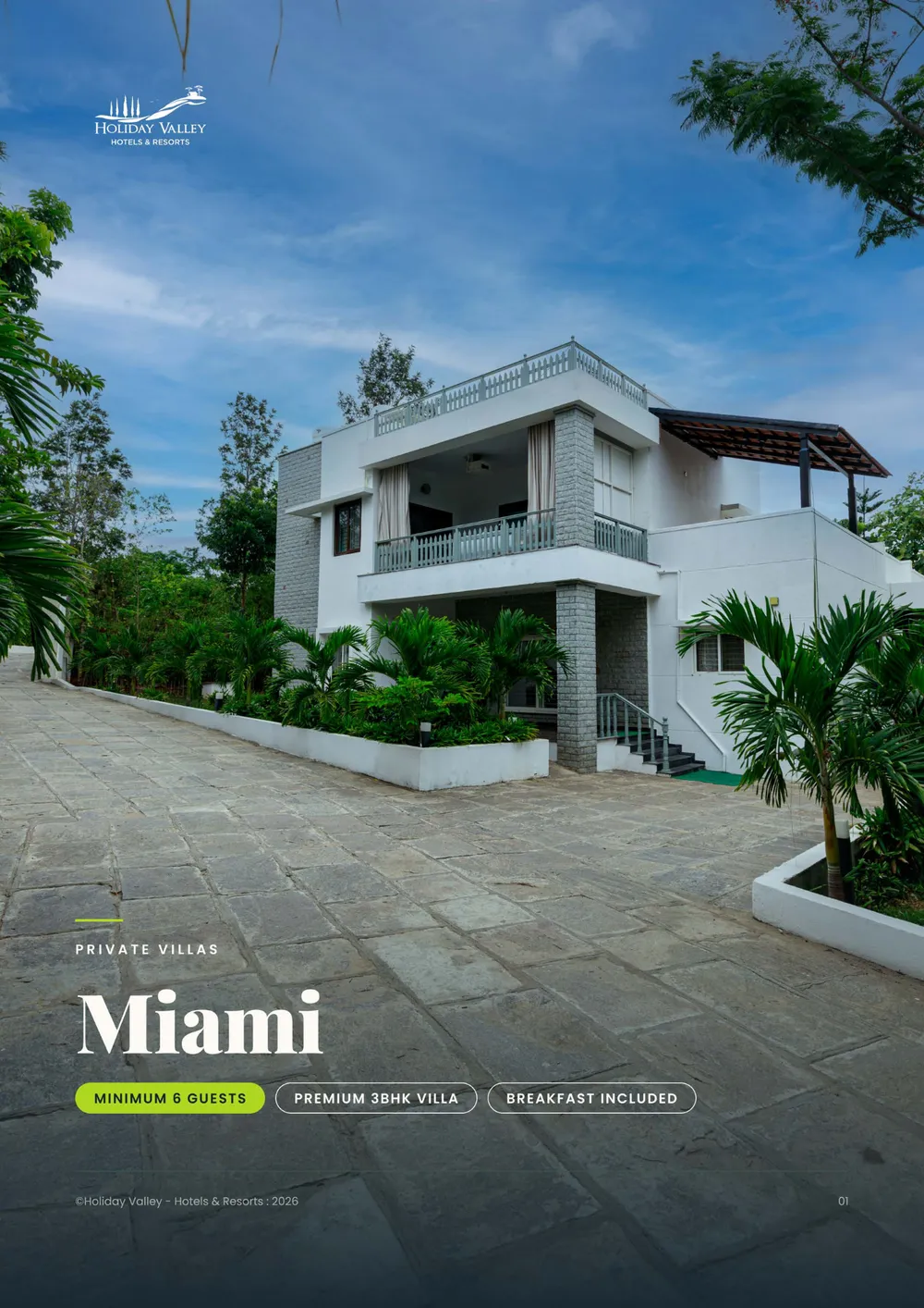
Miami · page 01 / 09 · Cover
A house with room for everyone you'd invite.
Choose a villa, then a page
Campaigns by audience
who is it for?
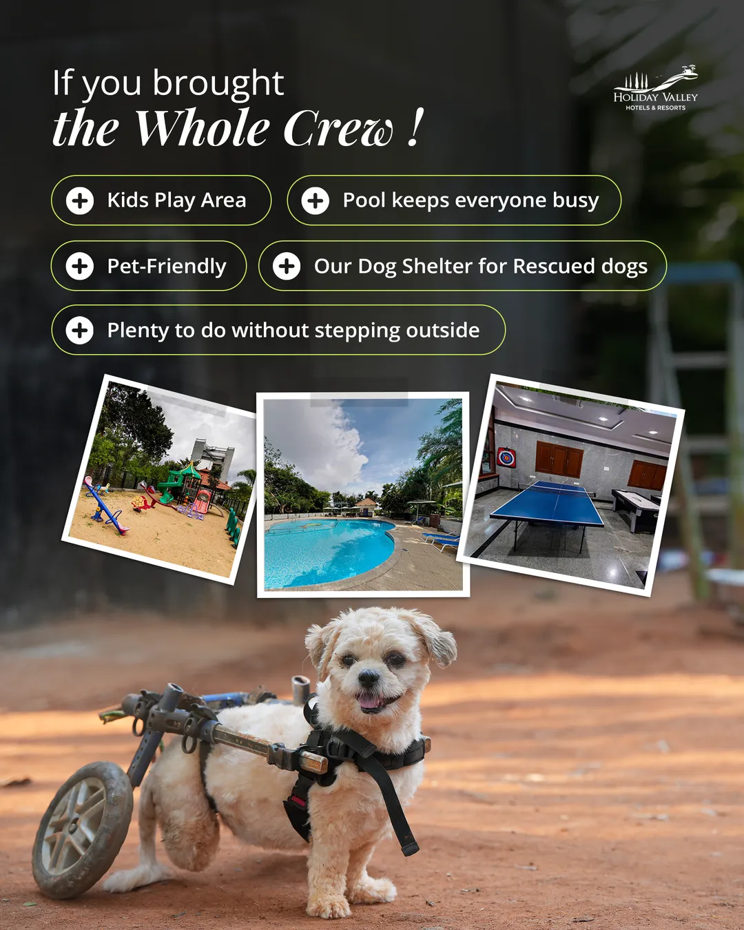
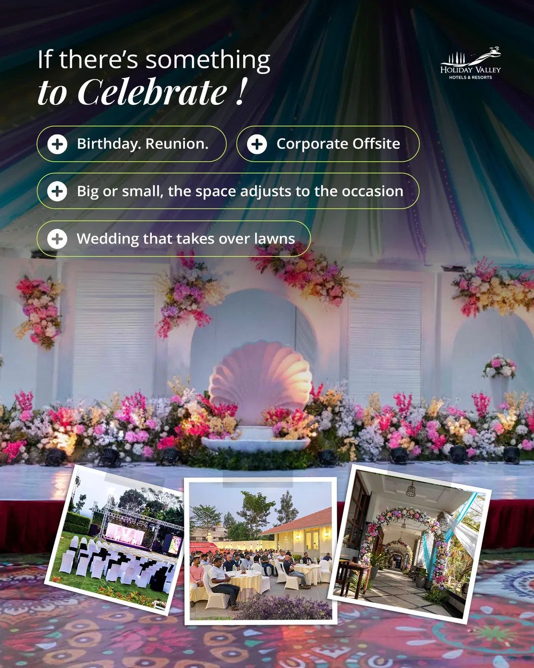
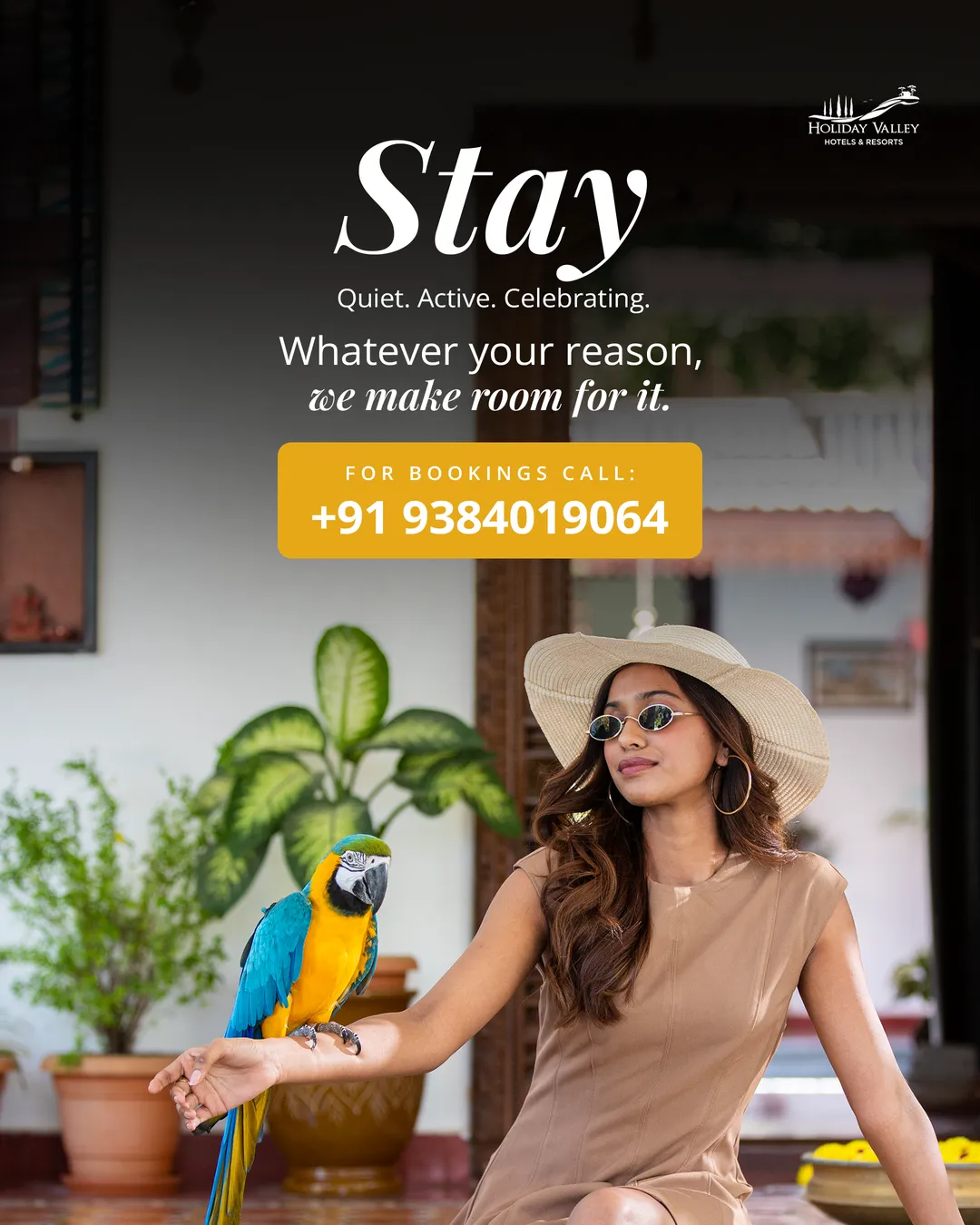
The resort sells different things to different people, so the feed is planned that way: day-trippers, couples and families, wedding parties, and the brand speaking for itself.
All of it comes from the same tokens and headline style, so a wedding post and a zipline post still read as one resort.
For couples and families: pick your mood, and the resort answers with what to do.
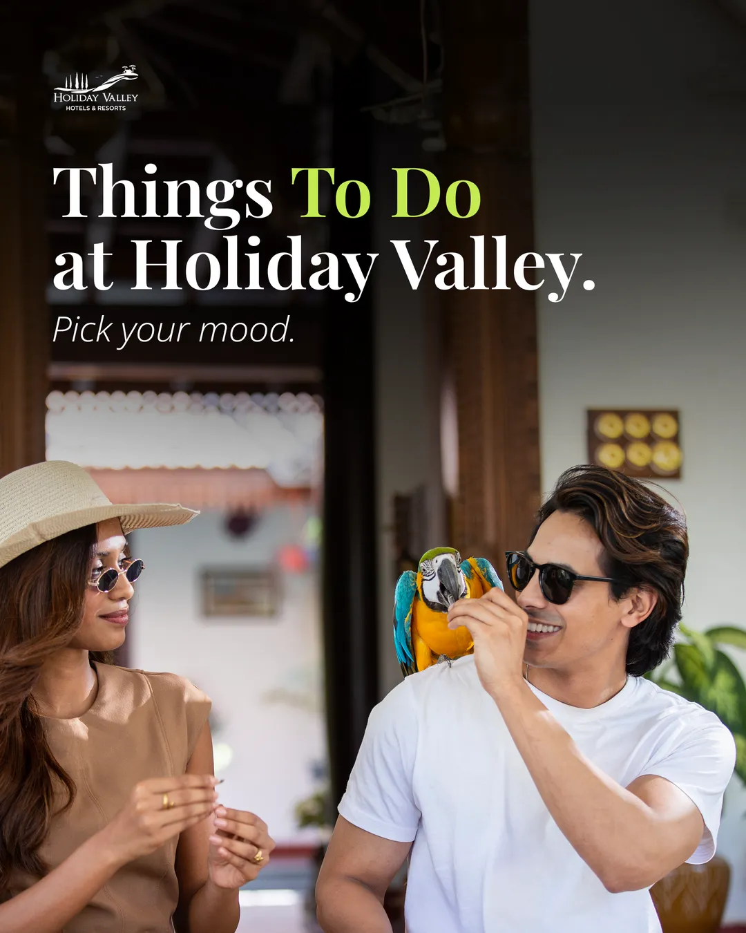
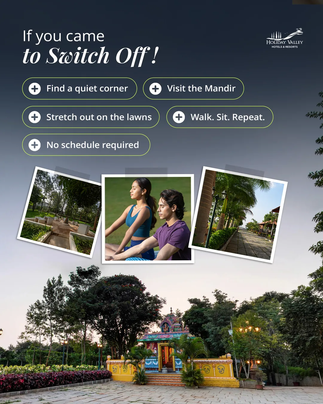
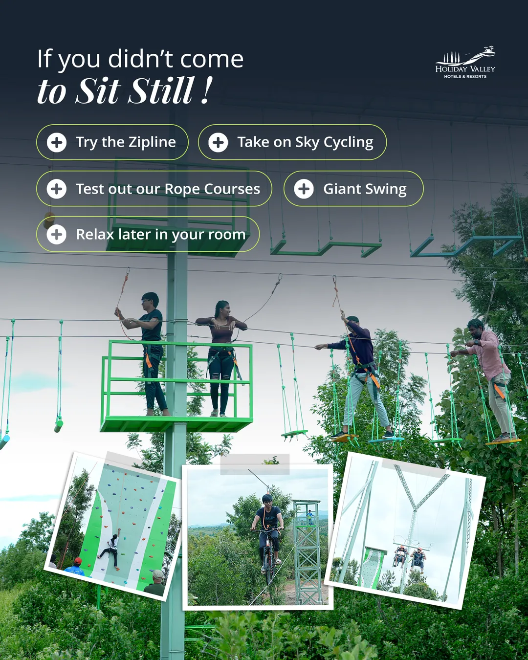
01 / 06
Around the year
festivals and offers
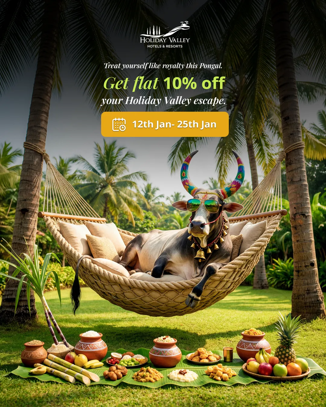
Festivals are where a brand is most tempted to drop its own look. These posters take on the season and keep the logo, the serif and the tone.
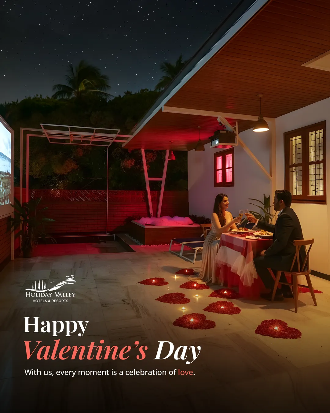
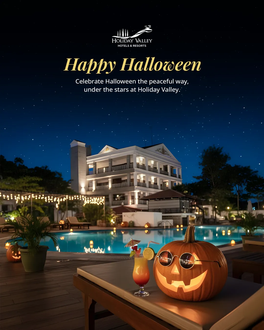
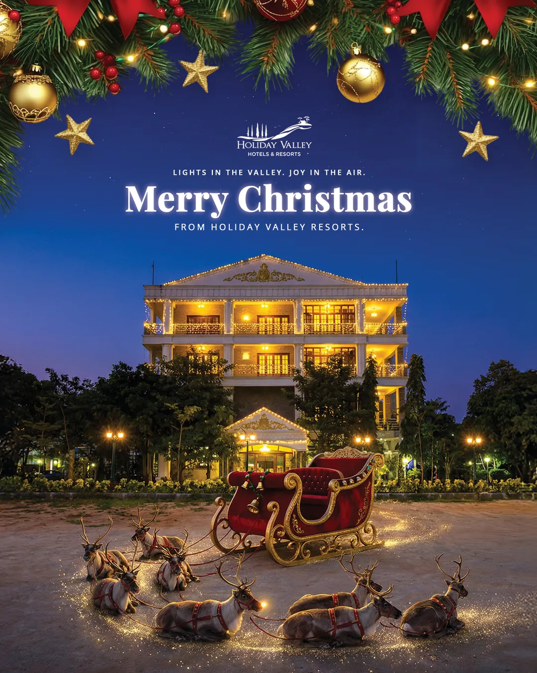
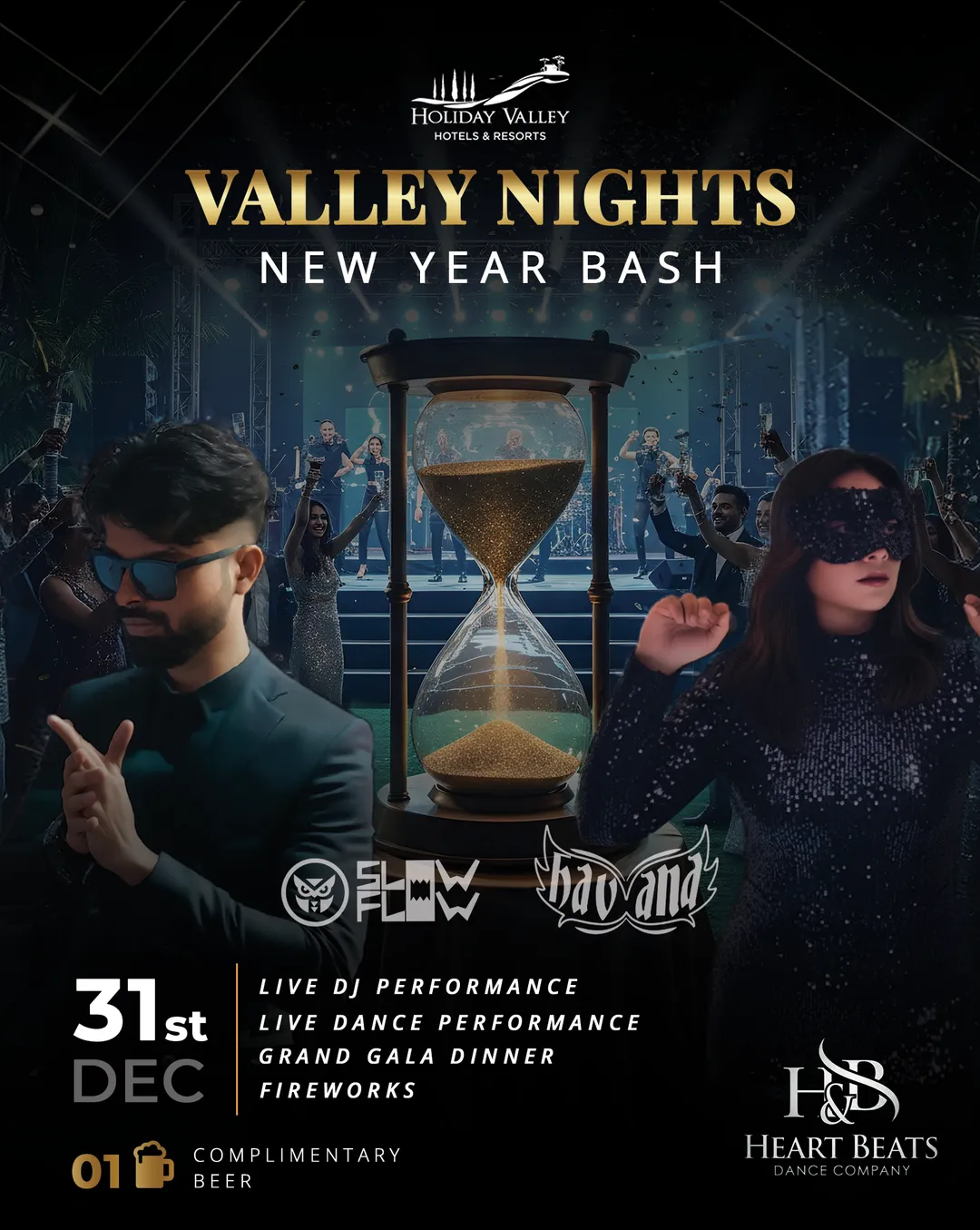
01 / 05
Beyond the feed
print and WhatsApp
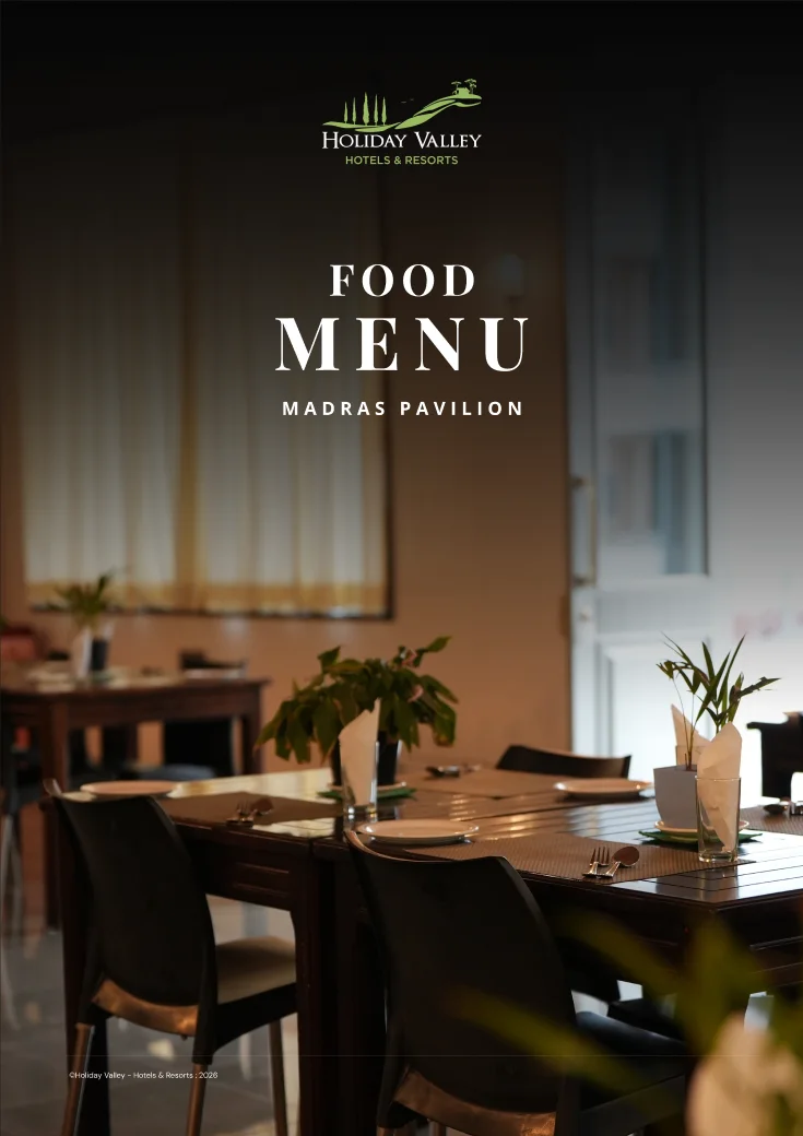
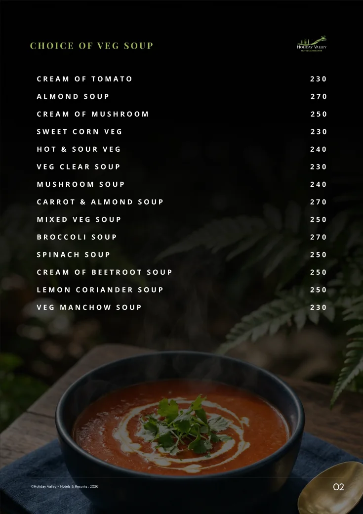
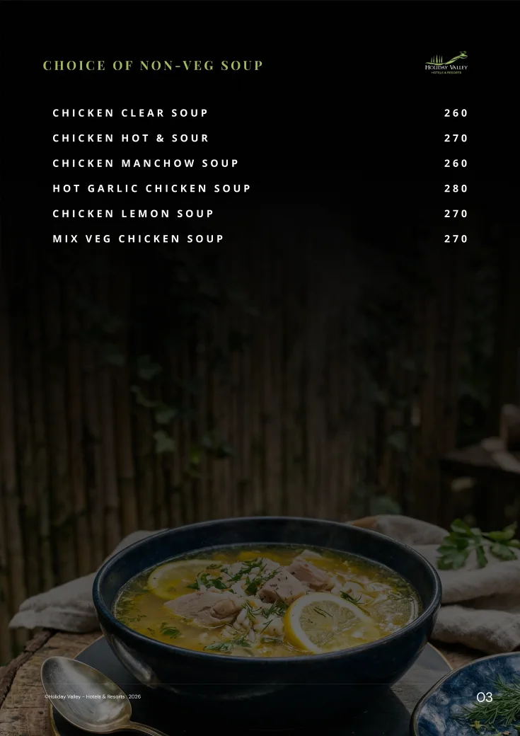
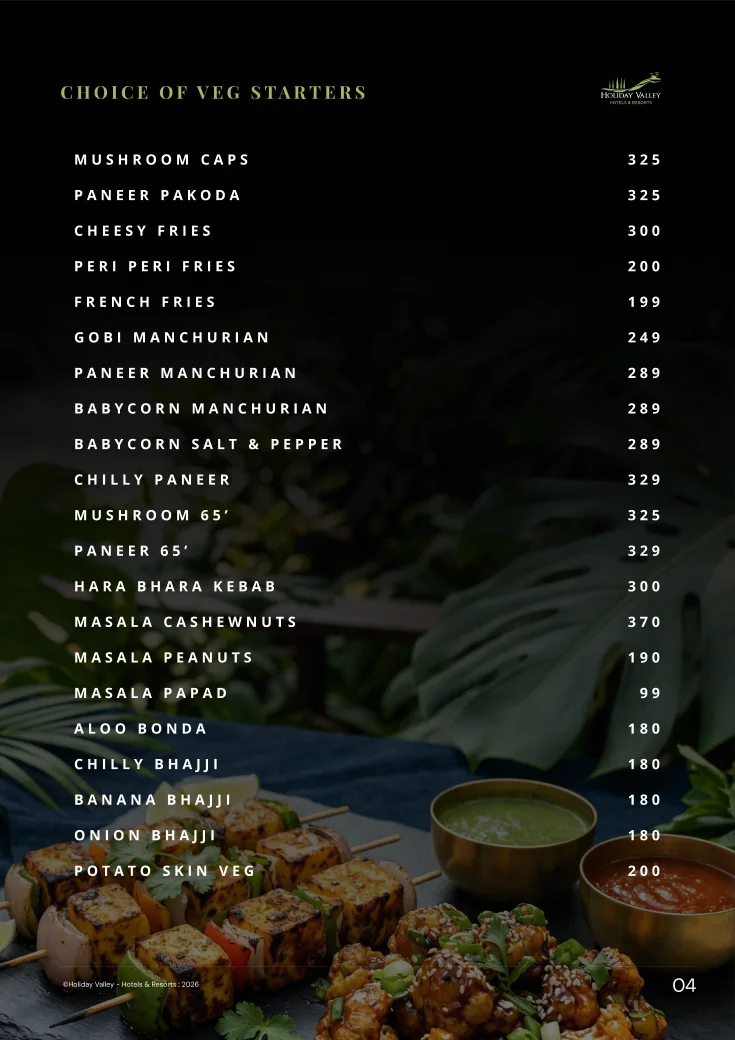
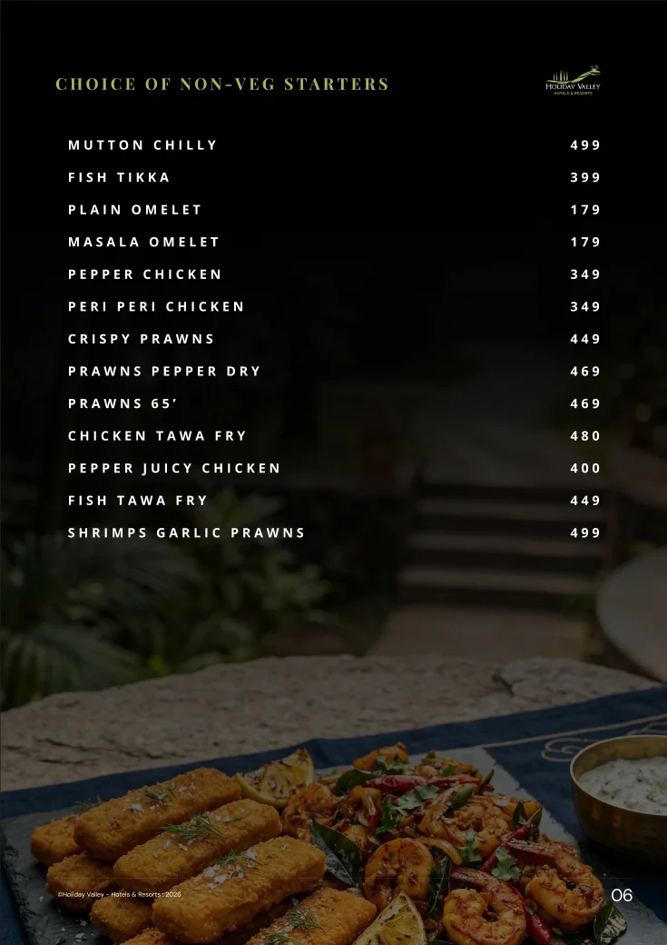
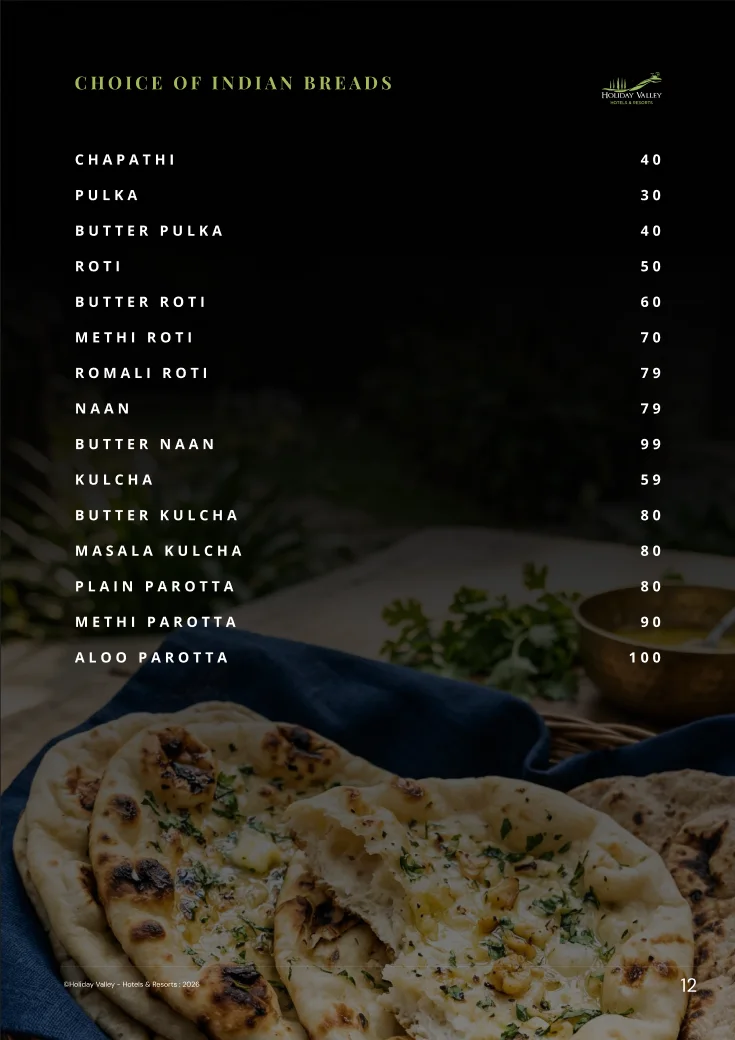
The same hand carries the food menu, fact sheets, tariff cards, stall banners and visiting cards, and the offer creatives that go out over WhatsApp with their message copy.
Images for a WhatsApp chatbot are being set up now.
The restaurant menu: cover, soups, starters and breads, set over food photography.
01 / 06
Teaching it
so it outlasts me
I packaged the system as a reusable skill, so an AI assistant or a new designer can produce on-brand assets without me in the room. I am training a junior designer on the account the same way.
The resort now has a consistent presence, a WhatsApp sales funnel and a library of assets it can keep building on.